the scoreboard in tc:e looks bald and dull, it could use some facelift.
first i wanna say that the devs shouldnt used weird font characters like: [..](..) <--- why? because it will ruin the whole interface, it makes it look so html'ish, and html'ish = amateurisme,
look this the current scoreboard:

you see, it looks html'ish with those weird [...] (...) characters, it kinda ruined the whole interface,
what i suggest is something like this:

^that scoreboard above^ has no weird font characters, so it looks more professional rather than 3rd party'ish program/html'ish,
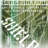
i used 2 theme colors for each side, terrorist/red, and specop/yellow,
why not red & blue? because red & yellow are the official team colors see:

and besides, i find red & yellow more original than red & blue.