TC:E's HUD status's like the stamina bar and the health bar... doesnt really look professional, it looks like that a bunch of "dont know how to design" developers created it, it could look smoother and more simple.
there are allot of things that are completely unnecesarry, i understand that the devs did it to make it more userfriendly for newbie's, wich is a good thing but there are some things that you shouldnt focus on, yes... you do need to put yourself in a perspective of a "new player that dont know nothing about TC:E" when it comes to game design,
but you should never put yourself in a perspective of a "RETARD"
for example... take a look at this picture here:

you see that the hud status contain useless things like the position status, someone with an everage I.Q. will notice if hes crawling/proning or standing, you dont need to have an status for that... its unnecesarry,
and the small "lightning flash" is unnecessary too.
see:

it just eats up the space of the player's screen, i do love HUD designs, but cool awesome fancy looking HUD designs, and not a HUD with unnecesarry things, so i suggest that the small tiny "lightning flash" and the postion status should be removed,.
i dont really like the health bar status "model", i dont like that the arms and legs are detached, it should be a whole model and the looks could be more smoother, because the health bar could give the game some characteristics. it should look good IMO because thats something you see on your screen/display constantly, "in other words... it is kinda important" it should look more representive, the current health bar gives the game a bad characteristic look,
now i suggest that the stamina and health bar should look more like this:

as you can see it looks smooth.. very professional... fancy... but simple... no useless status's, just the two important status's, the stamina and the healt status's.
but the problem with that is, "like the current one also"
is.. that you cant see your stamina/health when your hit by a flash nade, if your hit by a flash nade in real life you are still able to feel your condition/health.
so if you hit by a flash nade you basicly just see this on your screen:

wich is bad.. now the solution is to add/design a thin layer of rim around the status's something like this:

if you look good you can see like a black rim/pin stripes around the status's,
so if you're hit by a flash nade you should see this:

you see the white flash light on the background but you should still be able to see the HUD status's,
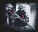
now that we know that the official color of the team side's are red and yellow, now i have to link this to something i suggested:
Dragonathan wrote:
SPECIAL SUGGESTIONnow why do the text colors of the 2 teams always have to be
RED and
BLUE in most games?
its starting to be a cliche for most games, "bad guys red, good guys blue" its rediculous and a bit overdo, well since
RED and
YELLOW is the offical TCE's color of terrorist and specop,
see:

why not make the
BLUE text color yellow, its the official specop color of TCE. so instead of a
BLUE text color above the player's head, why not make it yellow "the official specop color"
it should look something like this:

now the specop team should have a yellow themed interface and the terrorist a red themed interface, so what would be fancy/awesome is to make the HUD status's of both team look like this:

(i like HUD's, but professional looking/designed HUD's.)


